
0→1 agentic workflow, 85% faster claims
Founding designer for the agentic AI layer of Verisk Germany's claims platform. I ran UX workshops and user research, then set the information architecture, core workflows and design standards that govern it. It shipped on time under regulatory constraint and is bought today by some of Germany's largest insurers.
Representative interface: Tandem, a working agent console I designed and built end to end, where every agent states how far it may act on its own. Actual Verisk visuals are under NDA.
- Role
- Lead Product Designer
- Company
- Verisk Germany
- Duration
- Oct 2022 - Present
- Impact
- +85% productivity
- Team
- PM · PO · Developers · Design
Measurable gains, publicly reported
All figures publicly advertised by Verisk. Resilience and scale verified in production. See verisk.com.
Give an agent a surface
The platform already worked. Claims came in, experts worked them, cases closed. Then AI services were added underneath it, and the interface had no way to hold them. The same system sits behind Medical Expert Platform.
So the brief was not "add AI to the platform". It was: give an agent a surface. Capability visible before it runs, scope adjustable by the person accountable for the outcome, and every result traceable back to the case it came from. (Final UI under NDA. See the Studio for comparable interaction work.)
- The capability is invisible. The output looks identical whether the agent read three documents or thirty. There is nothing to render, so the interface has to state the scope instead of showing the work.
- Configuration is a permissions question wearing a settings UI. The person widening an agent's scope is a claims lead, not an admin, and the change carries legal weight. Every control has to carry its consequence with it.
- The system is non-deterministic. Same input, different output. Standard UI patterns assume a repeatable state to design against.
- "Relevant cases" is a claim, not a fact. When an agent cites precedent, the expert has to judge that relevance themselves, which means showing why a case was retrieved, not just that it was.
- Trust has to be earned before the answer arrives. Once the result is on screen the reader has already decided whether to believe it, so the transparency work has to happen upstream of the output.
Validate quickly, ship on time
I ran UX workshops with the medical, legal and claims experts to surface what the work actually required. Then I audited the pipeline for where automated extraction broke down, and mapped user logic states against LLM context constraints with the engineers, so what we designed stayed inside what could be built.


Architecture flowcharts went to tested variants, then to production-ready components, with no detour through speculative mockups. The LLM constraints stayed visible at every step. (Specific flow diagrams under NDA.)
The delivery ran on an : product intent to structured design prompts, prompts to working prototypes, kept safe by design review.
The stages and the lanes are the shape of the work. What sits in each cell is the client's, so it is held back. The ratio is the part that mattered to the design anyway: the AI is two stages of six, and the interface has to say which two.
Customer acquisition outpaced the roadmap. I delivered with the PM against fixed dates, scoped each release to land on time without mortgaging the system underneath, and took the strategic calls with the team, through to consolidating the system end to end.
Choose speed or risk, deliberately
It is tempting to push for full automation, the fastest path, the most impressive on paper. But for migration, error checks, and high-liability cases, we could not risk AI hallucinations. We had to choose between speed and risk.
For deeper examples of how I approach these tradeoffs in unrestricted work, see the Studio.
NDA prevents naming the specifics. Here's how I categorize the judgment calls behind this work:
- Probed before designing. What is v1 actually for, what already exists that we can use, and what is the shortest path for this user group.
- Knew what would ship and what would balloon. Front-end competence in the room meant "is this worth building?" came up at the sketch, not at code review.
- Traded fancy components for legible and fast. Insurance experts want predictability, not delight. The UI had to disappear into the task. (Specifics under NDA.)
Not the real UI. A complete redesign built for this portfolio, representing only services that are already advertised publicly.
- Fewer components, broader reach. Primitives that work across business units instead of a variant per team. Less to maintain, less to break.
- Built for two years out. Domain knowledge told me which components would have to absorb new states, rules and integrations later.
- Made room in the IA for business that did not exist yet. New products and AI surfaces could land without a re-platforming pass.
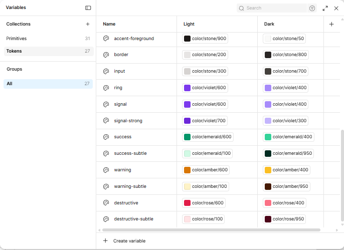
- Tokens on a tiered architecture. Global, semantic, component. Engineering implemented once and we re-skinned across units without touching component code. (Taxonomy under NDA.)
Not the real UI. A complete redesign built for this portfolio, representing only services that are already advertised publicly.
- AI went where the roadmap needed it, not where the screens had room. Integration points came out of the PM plans, not out of retrofitting existing pages.
- Regulated information, surfaced without slowing anyone down. Compliance carried by hierarchy and progressive disclosure, not by walls of mandatory text.
- Refused to ship AI as a blackbox. What it was doing, how sure it was, and one click to the source. Trust was a design surface, not a copy decision. (Examples under NDA.)
Not the real UI. A complete redesign built for this portfolio, representing only services that are already advertised publicly.
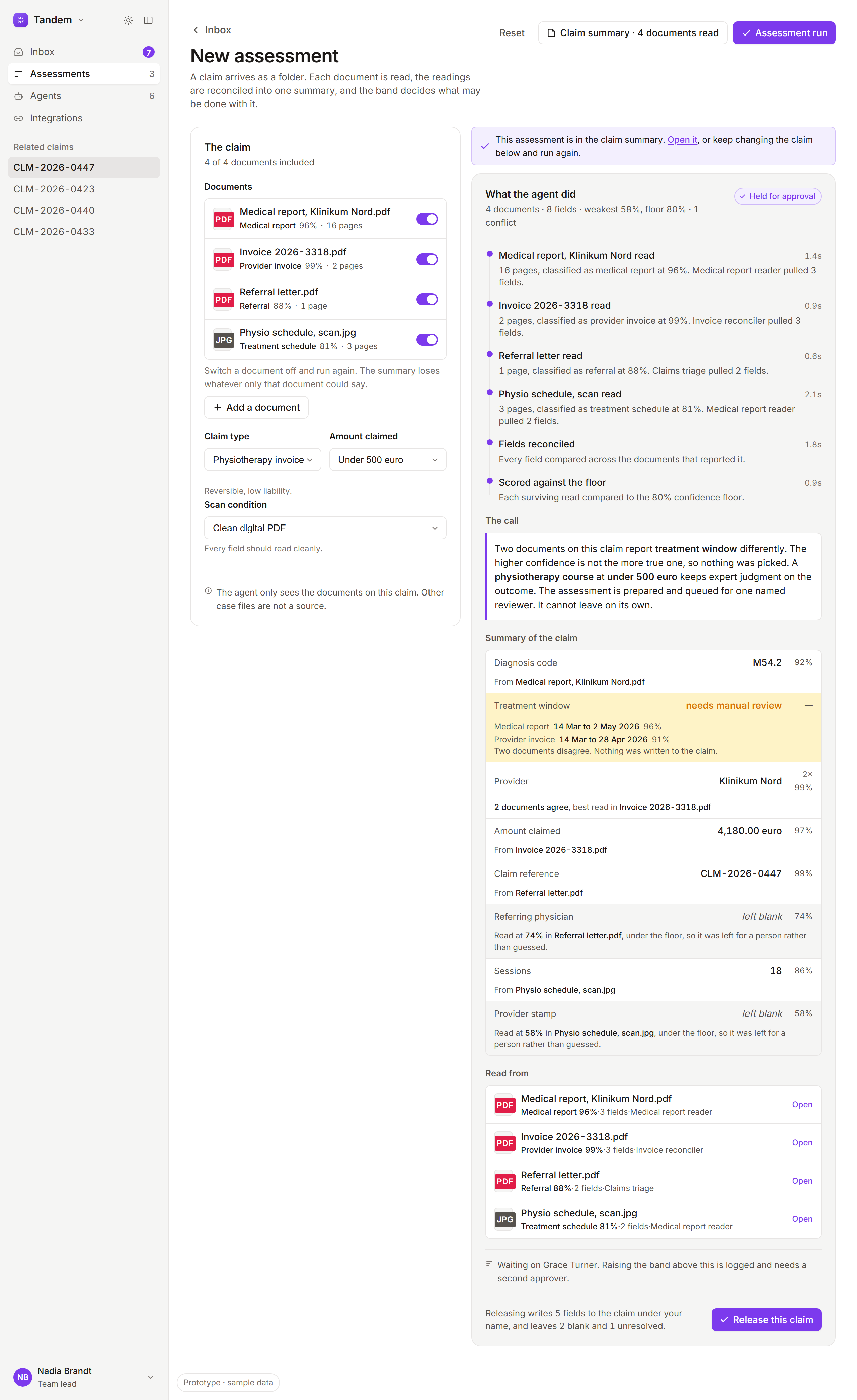
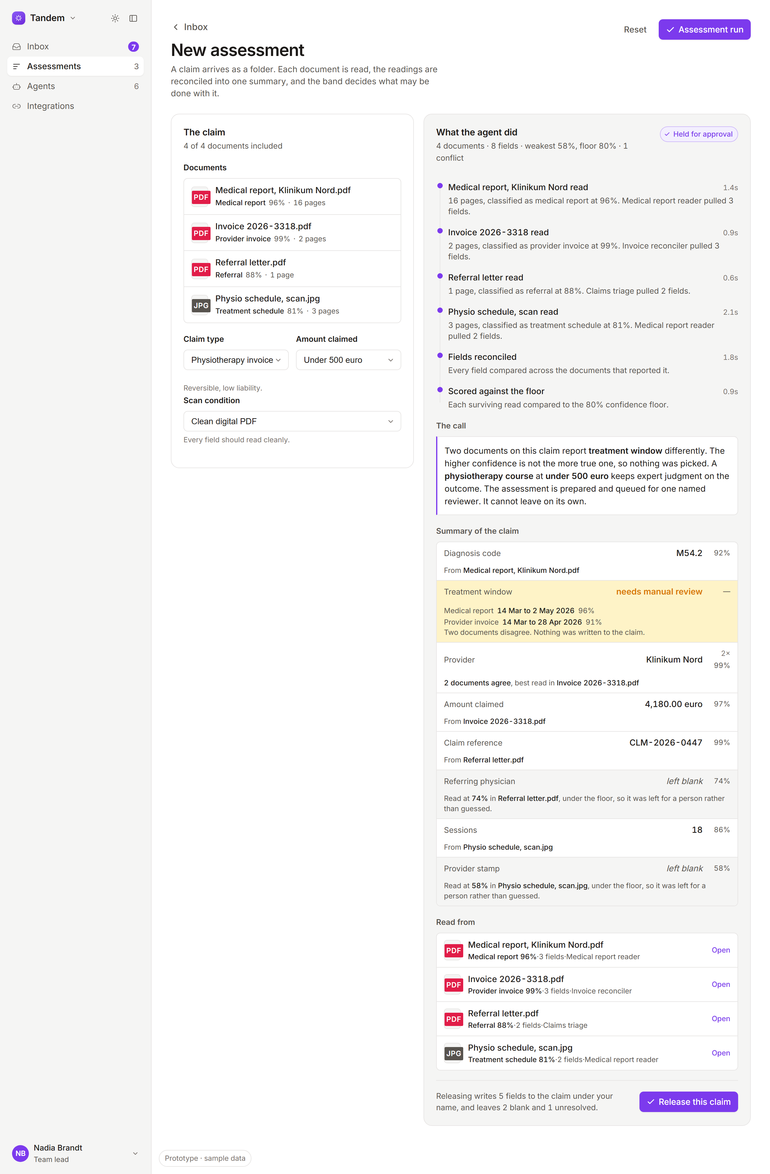
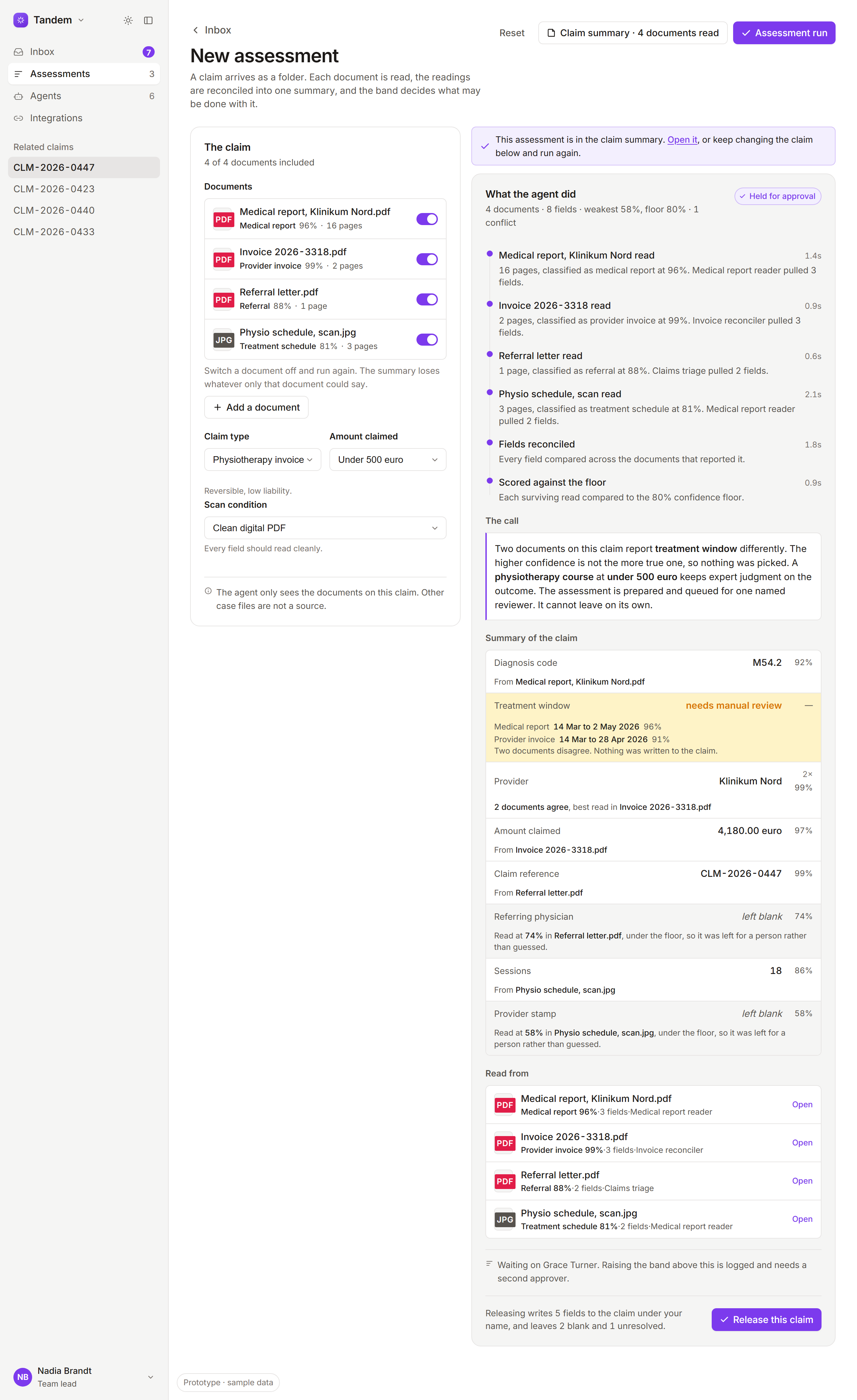
- It classified the document, and said how sure it wasNot a filename and a spinner. The type it decided on and the confidence it decided with, before anyone asks.
- It concluded what it may do with the readingThe band is the agent’s own answer to that, not a setting a person left behind on the screen.
- It showed its work, per documentWhich agent read what, how many pages, how long it took, and how many fields it got out.
- It refused to pick between two documentsThe higher confidence is not the truer one, so nothing was written and the field says a person is needed.
- It declined to guess under the floorA read below 80% is left blank with its reason attached, rather than filled in and quietly believed.
- Pushed back on data-modeling shortcuts. Wrong choices in the data layer compound for years, and the interface pays the interest.
- Only shipped features that moved efficiency. A competitor's cool feature had to name its underlying value first, or it got documented and shelved. (Specifics under NDA.)
- Scoped engineering effort against design value, per feature. The team moved from "can we build it?" to "should we, and at what cost?" (Rubric under NDA.)
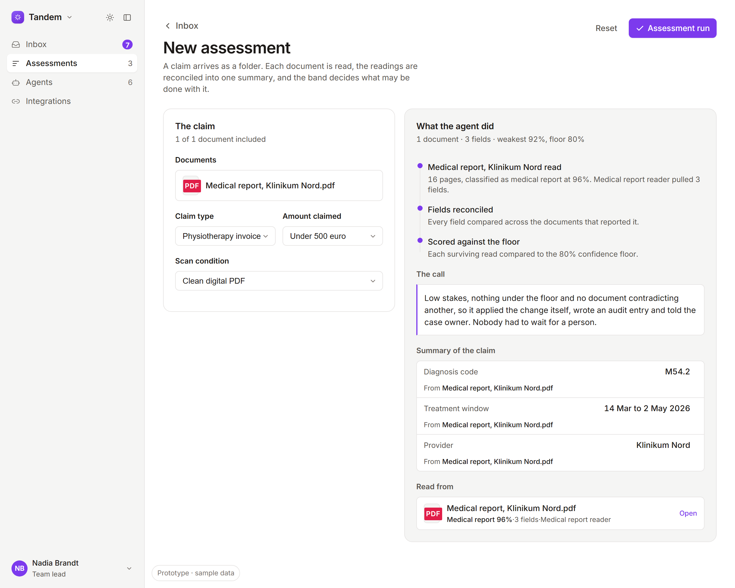
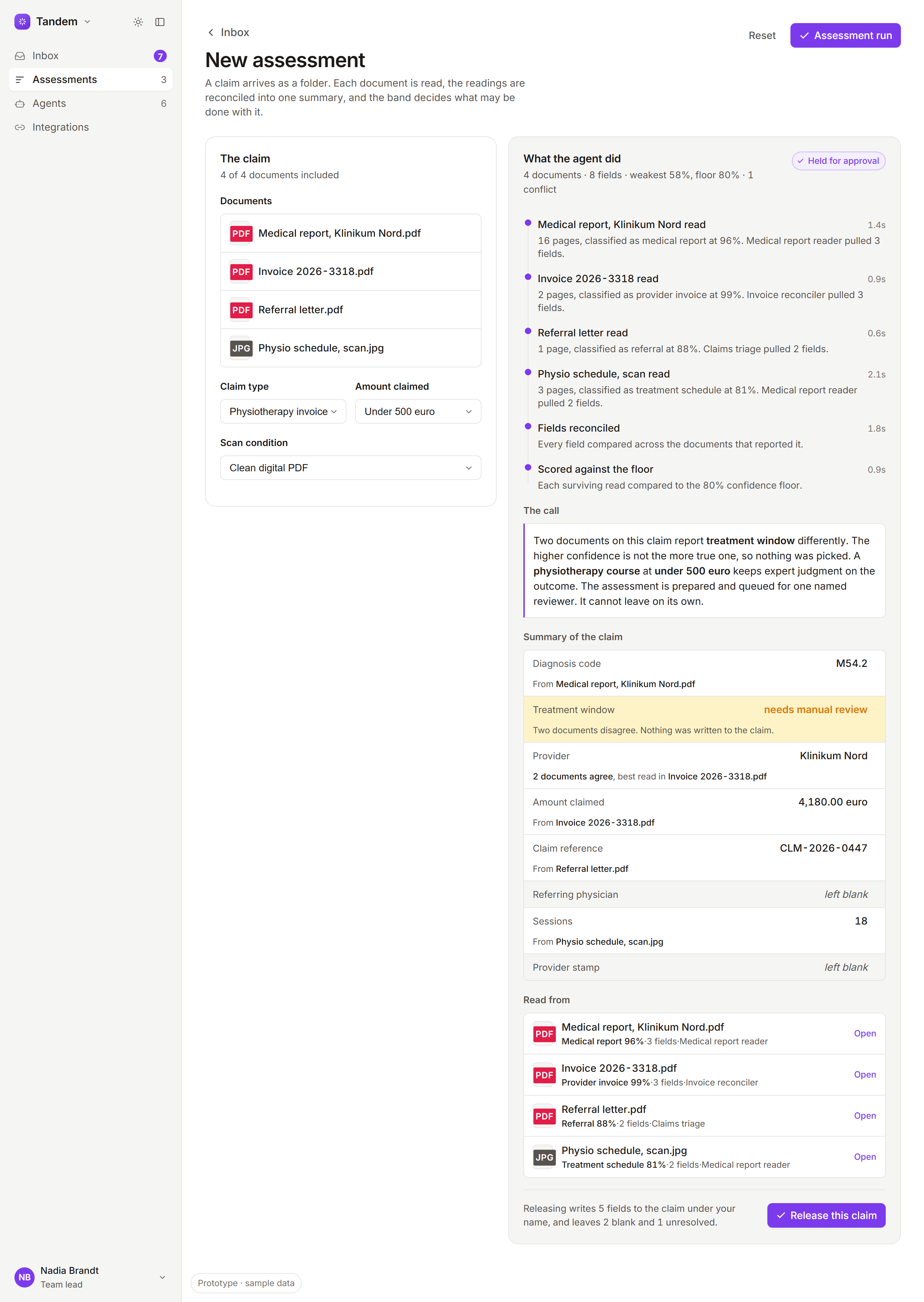
The assessment screen, built one capability at a time. Each version is the same page with features genuinely switched off, not a mockup of one.
Not the real UI. A complete redesign built for this portfolio, representing only services that are already advertised publicly.
Less interface, stronger system
The hardest interface problem in an agentic product is not what the AI does. It is what it declines to do. Every screen here that earned its place was built around a refusal: a field held because two documents disagree, a blank left where the read fell under the floor, a pattern across claims a person is allowed to notice and the agent is not. Confidence is easy to draw. Restraint is what people check you on.
And the front end kept getting smaller. Every time the model and the rules underneath it got stronger, a panel of controls stopped being necessary. Less to build, less to maintain, less for the assessor to read. Not every problem needs a new feature. Some need one fewer.