Agentic AI at Verisk
End-to-end UX design for an agentic AI system at Verisk Germany, streamlining claims processing workflows with LLM-powered automation, reducing manual effort and delivering measurable productivity gains across the insurance market.
Overview
I designed an external-facing app that puts agentic AI behind a simple interface. The hard part was making complex, multi-step automation feel transparent and trustworthy — for users who couldn't see the AI working inside. (Final UI under NDA. See the Studio for comparable interaction work.)
All figures publicly advertised by Verisk. Resilience and scale verified in production — verisk.com.
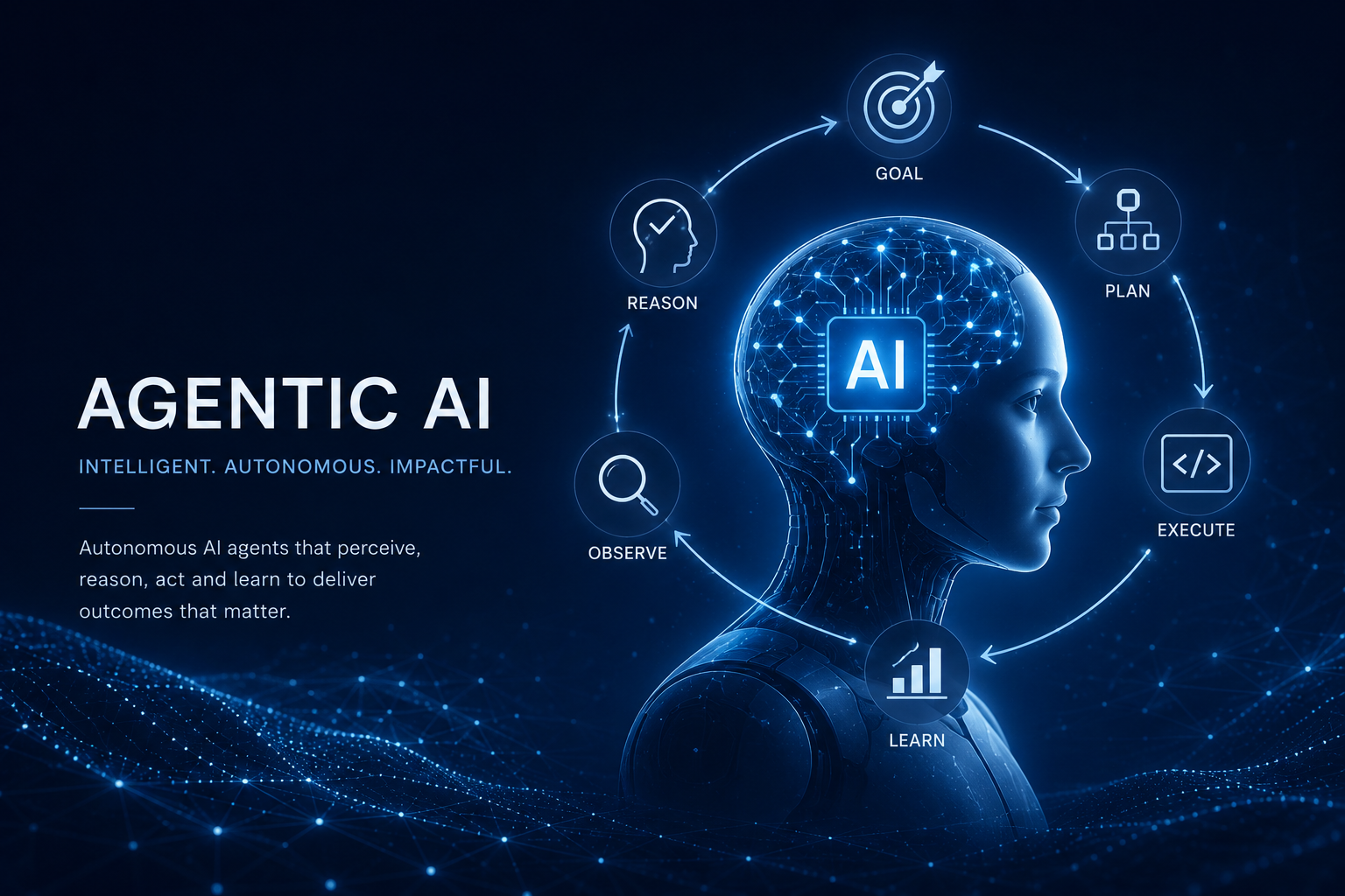
Process
I audited the claims pipeline to find where automated extraction was breaking down. Instead of patching the UI, I worked one layer deeper — mapping user logic states against LLM context constraints, so design and engineering thought in the same shape.
From there, I went from architecture flowcharts straight into production-ready components. No detour through speculative high-fidelity mockups. The LLM constraints stayed visible at every step. (Specific flow diagrams under NDA.)
Design Tradeoffs
It is tempting to push for full automation — the fastest path, the most impressive on paper. But for migration, error checks, and high-liability cases, we could not risk AI hallucinations. We had to choose between speed and risk.
For deeper examples of how I approach these tradeoffs in unrestricted work, see the Studio.
NDA prevents naming the specifics. Here's how I categorize the judgment calls behind this work:
Systems that scale
- Fewer components, broader reach. I designed primitives that work across business units instead of building separate variants per team. Less to maintain. Less to break.
- Built for two years out. I used insurance domain knowledge to predict which components would absorb new states, rules, and integrations over time. Today's screens, tomorrow's load.
- Made room for new business in the IA. I structured the layout so future products or AI surfaces could land without a re-platforming pass.
- Mapped design tokens to a tiered architecture. Global → semantic → component layers. Engineering implemented once; we re-skinned across business units and AI surfaces without touching component code. (Specific token taxonomy under NDA.)
AI with accountability
- AI integration points came from the roadmap, not the screens. I mapped where AI would help by reading PM/PO plans — not by retrofitting AI into existing screens.
- Refused to ship AI as a blackbox. I mapped the end-to-end so we knew where users had to trust the system. Added visual indicators for what the AI was doing, how confident it was, and one-click access to the source for cross-checking. Trust was a design surface, not a copy decision. (Visual indicator and cross-check examples under NDA.)
Shipping with judgment
- Pushed back on data-modeling shortcuts. When engineering wanted shortcuts in the data layer, I argued for product-first foundations. Wrong choices there compound over years.
- Only shipped features that improved efficiency. When a competitor had a "cool" feature, I asked: what's actually appealing here? If the underlying value fit our roadmap, we integrated it. If not, I documented the conditions under which we'd revisit, and sketched low-fi MVPs for those scenarios. (Specific competitor patterns and sketches under NDA.)
- Built engineering-feasibility intuition into the design process. For each feature, I scoped engineering effort against design value — and flagged which paths would compound vs. cost long-term. Shifted the team from "can we build it?" to "should we, and at what cost?" (Specific scoring rubric under NDA.)
- Compromised "fancy" components for legibility and speed. When polish-heavy patterns would have shipped at higher cost, I chose the legible-and-fast path. Insurance experts value predictability over delight; the UI had to disappear into the task. (Specifics under NDA.)
- Knew what would ship vs. balloon. HTML/CSS/JS and front-end library competency informed component decisions — including page-load and render-performance implications. The "should we build this elaborately?" question came up early, not at code review.
- Probed before designing. Asked: what's the goal of v1? What can we leverage from what already exists? What's the simplest, most intuitive path for this user group? We don't reinvent the wheel — we see what users actually need to do, then make the way.
Retrospective
We don't always need a new feature — sometimes it's just about simplifying and strengthening the LLM and having LESS front-end. Two birds with one stone: simpler for the user, and good for KPI.