
CuraCare
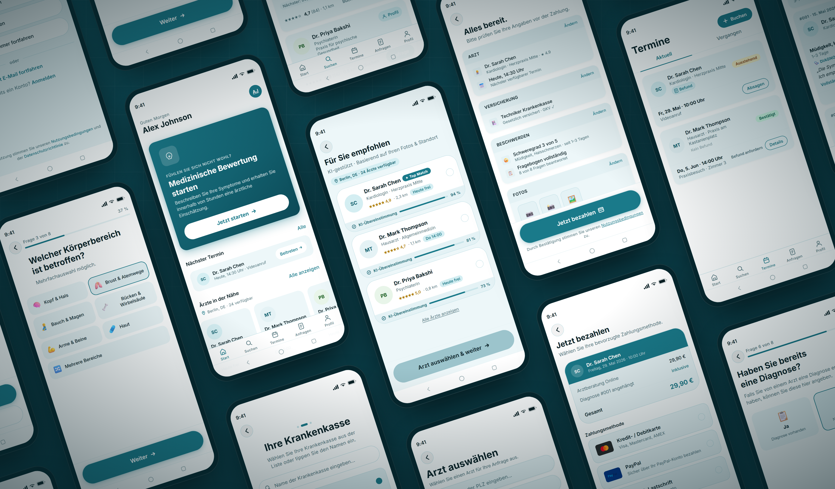
End-to-end mobile app design for a patient-doctor matching platform, from design system primitives through to production-ready screens.
- Role
- Solo Designer
- Platform
- iOS · Android
- Type
- Portfolio Exercise
The right doctor, for you
Healthcare discovery is historically fragmented, opaque, and stressful. Existing platforms like Doctolib and ZocDoc present dense lists with poor filtering and booking flows that feel clinical and impersonal. CuraCare removes that friction.
The core thesis: surfacing one great doctor is better than twenty mediocre ones. The matching feed uses an AI-assisted relevance model to immediately show patients the right specialist, based on symptoms, location, availability, insurance, and preferences.
Every design decision is anchored to one question: does this reduce the anxiety of finding a doctor, or does it add to it?
Two sides of the same problem
CuraCare is a two-sided platform. The primary design focus is the patient experience, with doctor needs informing profile and availability design.
- Patient · PrimaryAge 25–55, urban, smartphone-native. Needs to find a GP, specialist, or therapist, often under stress. Pain points: too many irrelevant results, unclear wait times, no sense of who the doctor is as a person, complex booking. Needs: fast matching, transparency, trust signals, easy rebooking.
- Doctor / Practice · SecondarySpecialists and GPs wanting to reach patients matching their expertise. Current platforms commoditise them as a list item with no personality. Needs: clear profile presentation, manageable availability slots, patient quality over quantity.
Built from system primitives
The design system uses a tonal palette model: 5 key hues each expanded to a 13-step tonal scale (tones 0 to 100), then mapped to semantic system roles for light and dark mode. Every token is backed by a Figma variable with text styles bound to typography variables.
Complete screen library
From first-open onboarding through doctor discovery, booking, and a full 5-tab main app, every screen is assembled from the same component library and design token foundation.
Onboarding & Booking Journey
- WelcomeCuraCare welcome / sign-in screen
- Matching FeedAI-assisted doctor matching
- Doctor ProfileDoctor selection list
- BookingAppointment booking
- ConfirmedAppointment confirmed
Main App: 5-tab Interface
After onboarding, users land in a persistent 5-tab shell (Home, Search, Appointments, Requests, and Profile), each built from shared components and live navigation state.
- StartHome / Start tab
- SuchenSearch tab
- TermineAppointments tab
- AnfragenRequests tab
- ProfilProfile tab
The decisions behind every screen
Five principles govern the design, anchoring decisions when trade-offs arise.
- Trust at every stepHealthcare decisions carry emotional weight. Every design choice should reduce anxiety, not add to it, from profile richness to confirmation micro-copy.
- Speed to the right matchThe matching feed should feel intelligent. Surfacing one great doctor is better than twenty mediocre ones. Relevance over volume, always.
- Human, not clinicalTone, typography, and imagery should feel warm and personal. Avoid sterile healthcare clichés. CuraCare should feel closer to a concierge than a database.
- Clarity over densityComplex information (availability, insurance, specialty) must be presented simply. Never sacrifice comprehension for completeness. Progressive disclosure over walls of text.
- Accessible by defaultTouch targets ≥ 48dp, WCAG AA contrast minimum, clear focus states, readable type at body scale. Accessibility is not a checklist. It is the baseline.