
Forkful
A complete meal-logging loop for mobile, from first-run onboarding through a four-tab app, built as a working prototype rather than a screen set.
The real build, running. Click the phone to take the controls.
- Role
- Solo Designer
- Platform
- iOS · Android
- Type
- Portfolio Exercise
The loop, not the screens
People do not abandon calorie trackers because the arithmetic is wrong. They abandon them because logging a meal costs more attention than the meal is worth. Yazio, MyFitnessPal and Lifesum have all solved the food database. None of them has solved the daily price of using it.
Forkful takes the part that actually decides whether an app survives week two: the loop between opening it, logging something, and getting an answer back. Four tabs, one dashboard, and a logging path short enough to finish standing up.
It is built, not mocked. Every number on the dashboard is live: log against a meal and the ring, the macro bars, and the remaining count all move. That constraint is the point of the exercise, because a flow only proves itself when it runs.
One person, two moments
Tracking apps are not used the way they are demoed. The demo shows a considered session; the reality is a handful of fifteen-second visits between other things. The design targets those two moments separately, because they need opposite things.
- The returning logger · PrimaryOpens the app three to five times a day, usually mid-task, often one-handed. Wants one number (what is left today) before anything else, and a path to logging that does not require a decision. Every extra tap here is a reason to stop tracking by Friday.
- The first-timer · SecondaryHas no target yet, so the app means nothing until it gives them one. Needs the shortest honest setup that can produce a daily number: goal, activity level, target. Anything more is a form standing between them and the product.
Worth stating plainly: this is a self-directed exercise. The user model comes from the category's well-documented failure mode, first-week drop-off, and from the patterns the incumbents converge on. No research was run for it, and nothing here is presented as a finding.
One system under four tabs
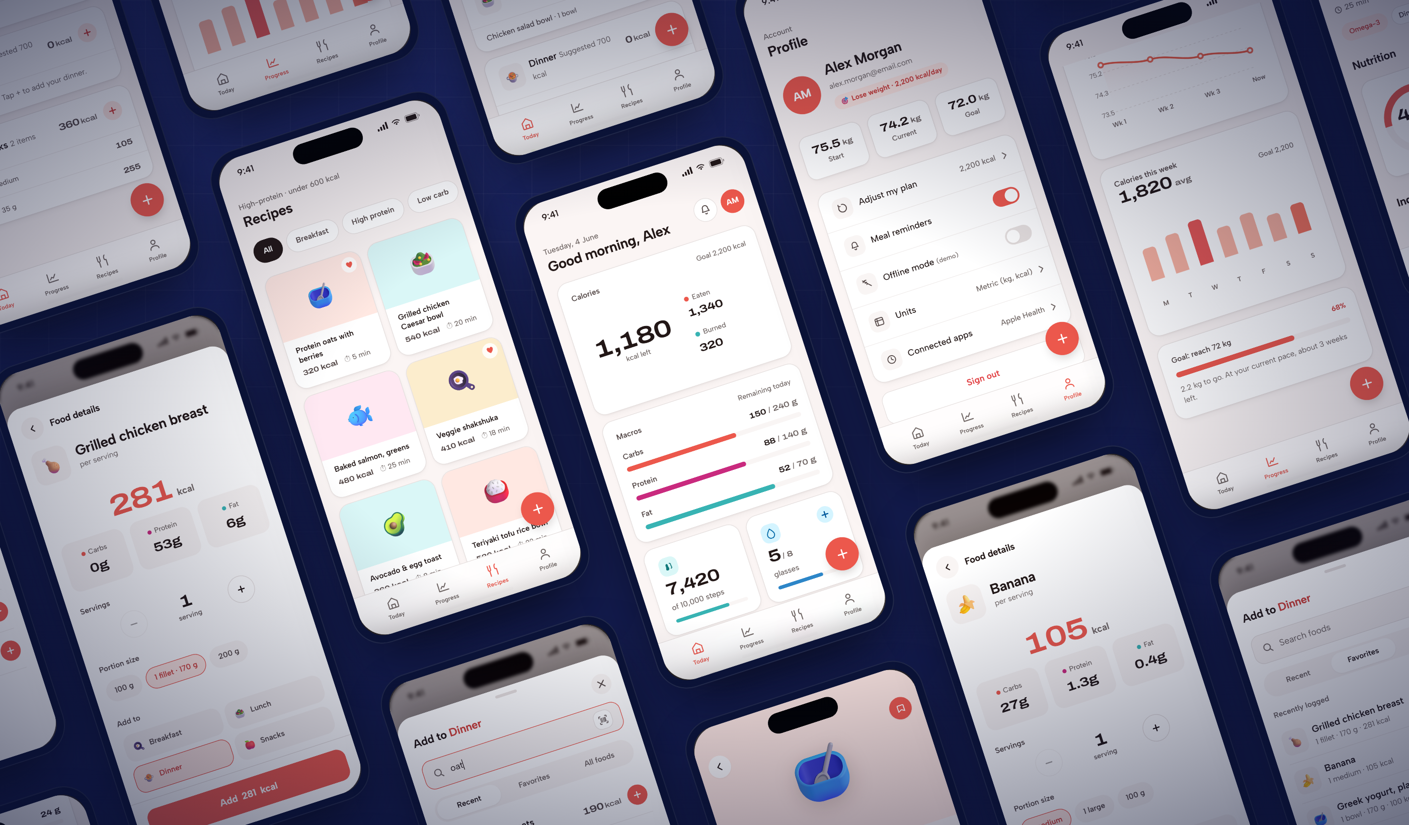
The interface is assembled from a small token set rather than drawn per screen: one type scale, one spacing step, and a semantic colour layer where each macro and each state owns a role. The bento tiles, the meal rows, the sheets, and the recipe cards are the same handful of primitives arranged differently, which is what keeps a four-tab app from drifting into four visual languages.
Setup, dashboard, logging, progress
The prototype at the top of this page runs all of it: first-run onboarding, the daily dashboard, the logging sheets, and the two tabs that give the logging a reason to exist. Click the phone to take the controls.
First run
- GoalLose, maintain, or gain. The one question that changes every number after it
- ActivityFour levels, plain language, no formulas shown
- TargetThe daily calorie number, calculated and handed back before the app asks for anything else
Main app: four tabs
Four tabs, not five. A tab bar earns its slots by what the visitor returns for, and a fifth would have been a place to put things rather than a place anyone goes.
- TodayA bento dashboard: the calorie ring with what is left, macros remaining, water, logging streak, weight trend, and the four meal rows that are also the way in to logging
- ProgressFour weeks of calories and weight, because a single day is noise and a trend is the only thing worth reacting to
- RecipesA filtered list (high protein, under 600 kcal) into a full detail view with per-serving nutrition, ingredients, and directions
- ProfileAccount, targets, and the settings that change the maths
Logging
- Meal rowBreakfast, lunch, dinner, and snacks are buttons, not headings. The row you are looking at is the row you log into, so the app never asks which meal you meant
- Add sheetOpens already addressed to that meal, so the first interaction is choosing food rather than restating context
- Food detailsPortion and quantity, then back to the dashboard with every figure updated
The decisions behind the loop
Five rules govern the build, and each one is visible in the running prototype rather than only in this page.
- The answer, firstThe largest number on the screen is the one the visitor opened the app to get: calories left today, in the middle of the ring. Eaten and burned are the supporting arithmetic and are sized like it.
- Logging is the shortest pathThe entry point to logging is the thing you are already reading. No floating button competing with content, no separate add flow to learn.
- Be honest about going overExceeding the target shows as a plain chip stating by how much. Trackers that hide the overshoot teach people to distrust the number, and a number nobody trusts stops being logged against.
- Degrade, do not disappearWith no connection the app says so and keeps showing the last saved day. A tracker that goes blank on a train has lost the visit and probably the habit.
- Reward the streak, not the dayProgress is framed over four weeks and a logging streak, because a single heavy meal is not a failure and an app that treats it as one gets deleted after it.